Book Design
Design + Project Management
My love for meeting new authors and hearing their unique stories runs deep. Through my work with Davis Creative Publishing, I have developed new design processes and project workflows to ensure we bring an author’s story to life in the most successful way. In my design process, I seek out the feelings and emotions the author wants to convey to their audience. I want their book to connect with their readers both visually and within the written word.
All publishing projects are managed through Davis Creative Publishing. They are the BEST in the self publishing biz! Please reach out for a referral and I will be happy to connect you. Request my design services when you engage in a new contract.
The Hunger Crime
#1 International Best Seller
Inspired by true events, humanitarians John Crisci and Trudy Bower collaborated on this powerful story to shine light on this important work. The book cover with its bold text and strong visual contrast, commands attention. The fiery color scheme was intended to give the reader an uneasy feeling and add to the “thriller” quality of this novel. As you look further beyond the visual of an empty bowl, a subtle Bitcoin emblem is embedded to illustrate a critical part of the story line to spark reader curiosity. This book was vastly successful in the US and beyond and reached #1 International Best Seller. It has since been translated into Italian as well.
Paperback + eBook
My Lights
International Best Seller
This memoir was intended to offer encouragement, hope, and validation of the importance of being true to your authentic self. Steve’s powerful story shares the truths and hardships of his life going up as a gay man. Through his life’s journey he found ‘lights’ that helped lift him up and kept him moving forward. In the design of this cover, we wanted to show the light coming from the darkness and create an intriguing and hopeful image to grab the reader's attention.
Paperback + eBook
The Woman Who Saved Love
#1 International Best Seller
During this time period, books with a high white contrast were showing great success in the publishing world. Simple yet purposeful designs were trending with readers. This book was a perfect fit for this trend and played off its whimsical romantic storyline. The feminine hands symbolize the story’s heroine and spread out widely to convey an openness to making new connections. The word LOVE rests within the hands spread out. And the author’s name grounds the cover design without making the design too fussy. This book was a hit and reached #1 International Best Seller.
Paperback + eBook
Fish Dreams
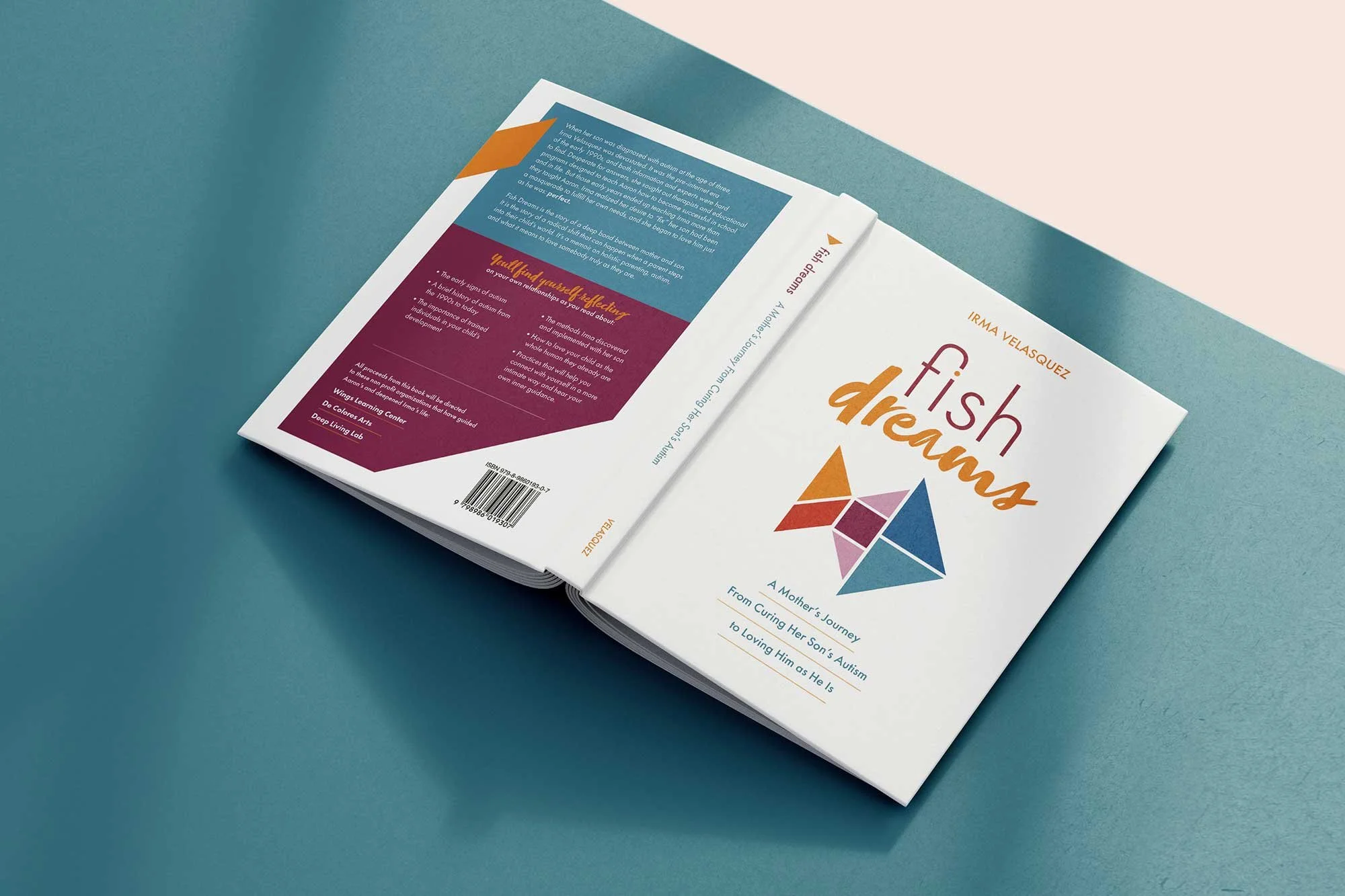
This book design needed to feel focused and uncluttered. Drawing inspiration from tangram puzzles, the pieces of the fish can fit together in so many ways to create new things. Those pieces are representative of the journey within the book. Bright, jewel tone colors, as well as the use of white space add a feeling of hope and clarity. It gives way for the book’s title to really stand out.The typography is approachable and playful, while avoiding a primary/childish tone.
Paperback + eBook
Protect Your Lifestyle
With a high contrast design to enhance visibility on both the physical and virtual bookshelf, the reader’s eye is drawn to the center book title. This book sheds light on the complicated topic of personal insurance. Through the use of icons, we visually show that the author will break down the basics so the reader can understand and feel empowered to make insurance decisions. The color palette and typography are friendly and approachable, as this is not your typical stuffy insurance book and intended for applications to your everyday life.
Paperback + eBook
Deep Living Lab Collection
Underneath Your Personality
The cover design reinterprets visual elements from the parent book, Deep Living with the Enneagram: Recovering Your True Nature. The streamlined design provides an approachable tone for readers new and curious for the subject matter. This cover remains in the same color family as its parent text but also adds an additional softer hue. The spiral design quickly reveals layers as well as an element of fun. The author’s name continues this element as it follows the curves.
Paperback + eBook
Deep Coaching, 2nd Edition
As a second edition book, this cover design needed to have a nod back to the 2007 edition. This fresh look has layers of complexity with rich gold tones and deep purple. The “Deep” typeface treatment is brought over from the series parent, Deep Living with the Enneagram: Recovering Your True Nature for a visual connection. Layered images of a healthy full tree and its roots visually communicate the “deep” message. Finally, the typography is professional, approachable and easy to read in order to appeal to a mature professional audience.
Paperback
Guidebook for Deep Living
This book was a companion text to the parent book, Deep Living with the Enneagram: Recovering Your True Nature. The cover design needed to have a connection to the parent but also demonstrate it was an interactive workbook. The predominantly white cover signified there was color to add inside for the reader. Also, an element from the original cover was added but with a vivid filter applied, as well as the enneagram symbol in the background for a quick read and connection to the content.
Paperback


